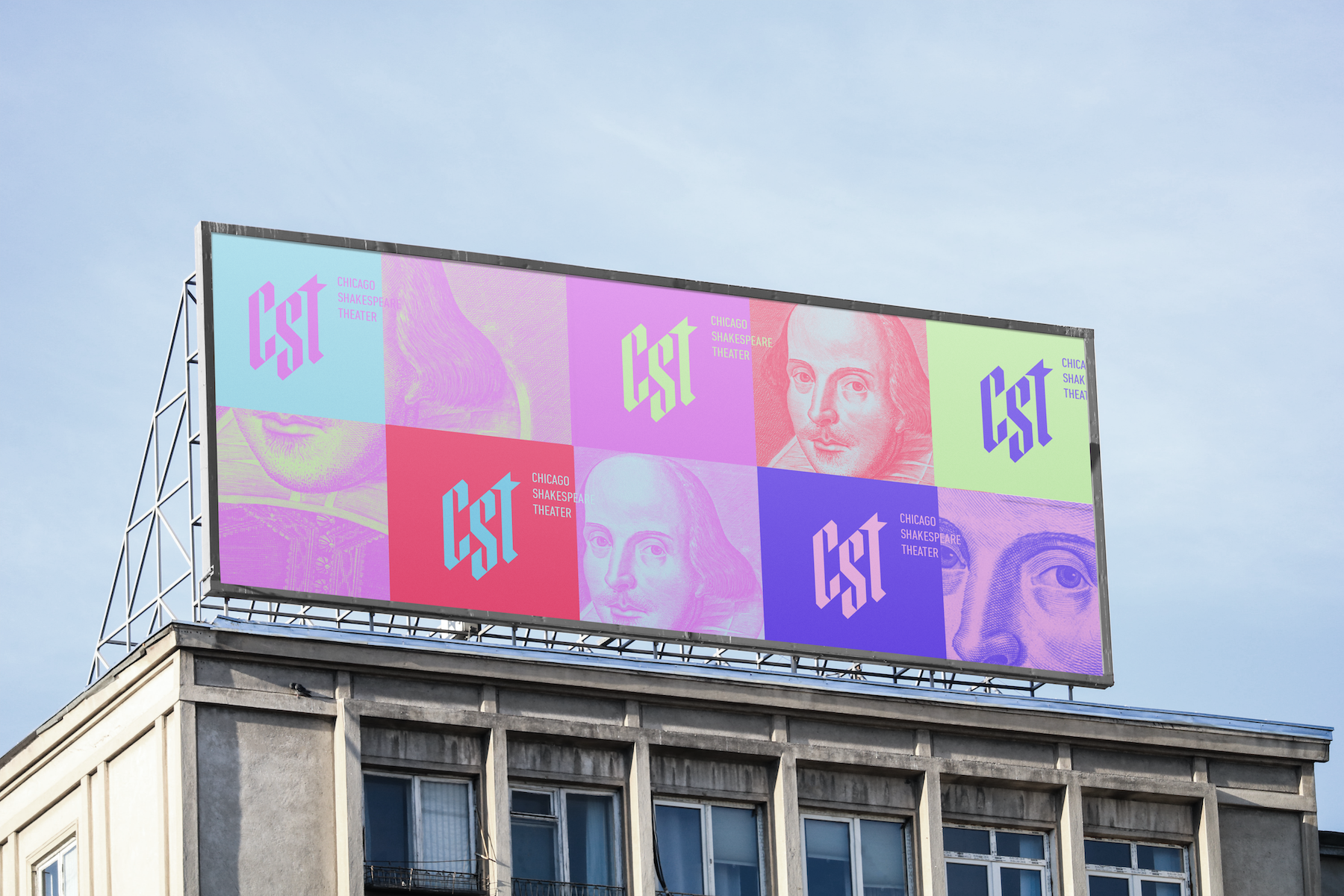
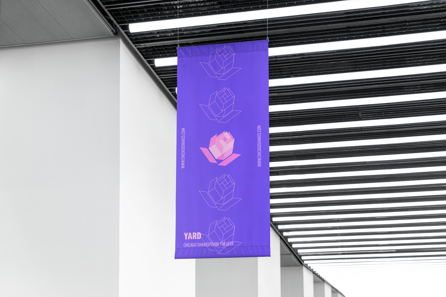
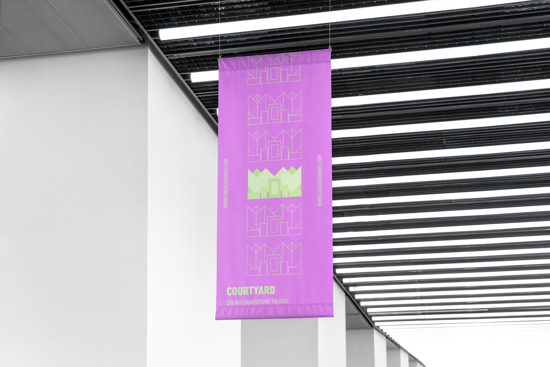
Chicago Shakespeare Theater, with a modern twist.
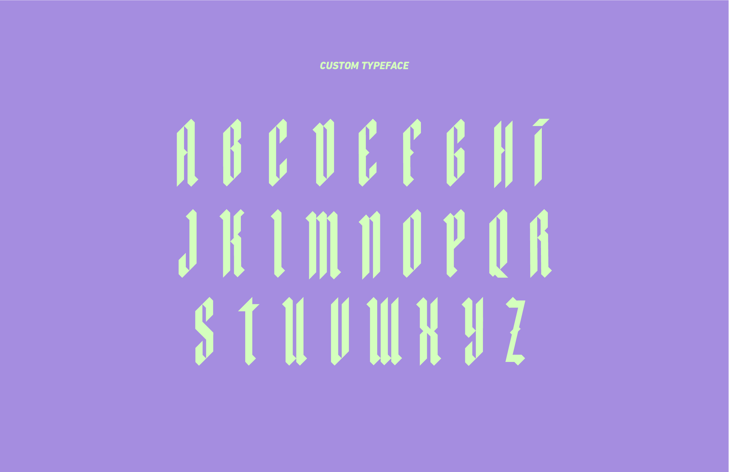
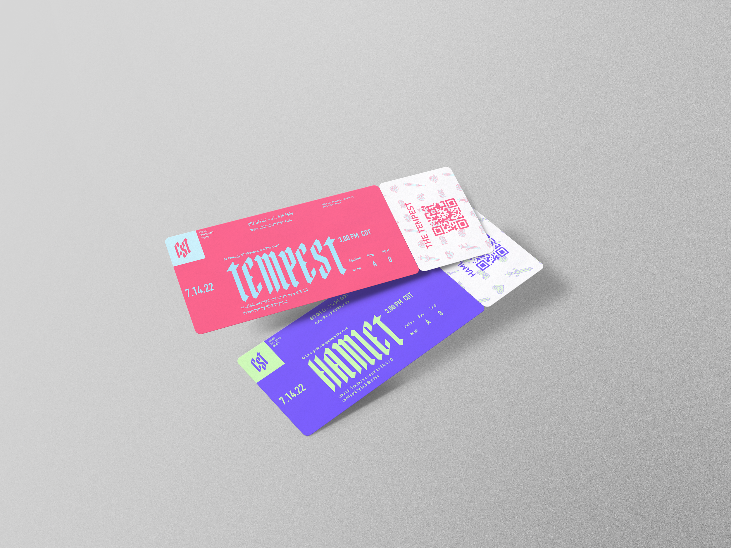
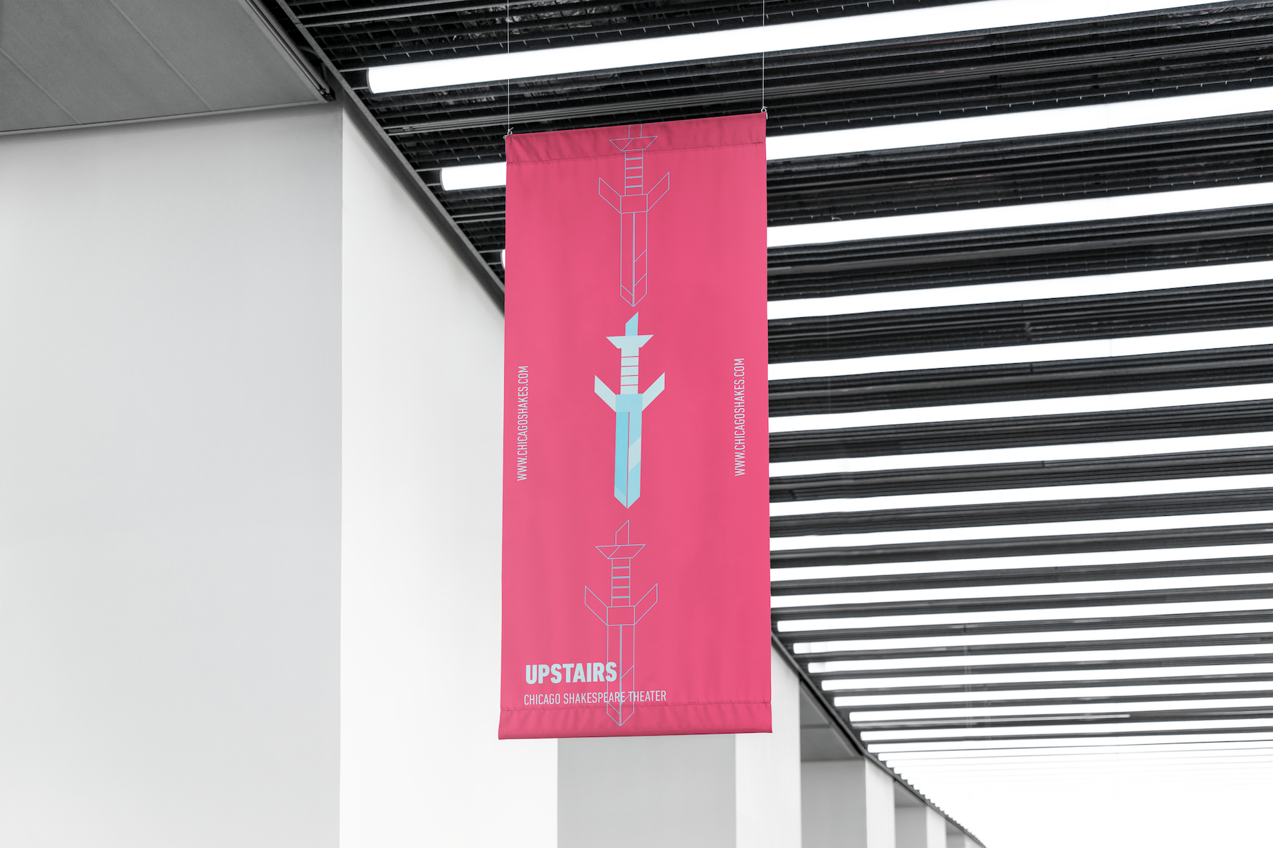
The core idea for the rebrand proposal is to combine the past and the present, given the modern take on timeless Shakesperean productions performed in the theater. The color palette, extensive and bright, along with a custom blackletter typeface were elemental to bring these two concepts together.